Updated for 2026: A high-converting website isn’t just a “nice design.” It’s a measurable system that turns the right traffic into leads, bookings, or sales—consistently. If your ads are getting clicks but your website conversion rate is flat, this checklist will help you spot leaks fast and fix them with confidence.
This post is written for small to midsize business founders who already understand funnels, lead gen, and acquisition. The goal is to help you implement conversion optimization like an operator—not a dabbler.
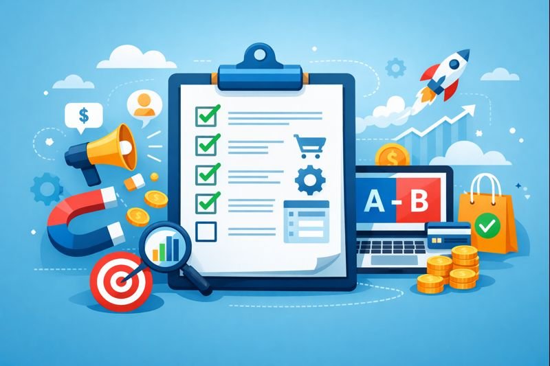
How to use this checklist (so it actually increases revenue)
A checklist only works if it tells you what to do first. Here’s the order that tends to increase website conversion rate fastest for SMBs:
- Fix measurement before you fix pages.
- Otherwise you’ll “improve” the wrong thing and never know it.
- Repair the biggest leaks next:
- Speed, broken CTAs, confusing forms, weak offer clarity, missing trust.
- Then run controlled tests (CRO).
- Testing is a multiplier once the basics are stable.
A practical workflow you can run in 30 days:
- Day 1–2: Tracking and funnel QA (Step 0).
- Day 3–7: Fix the top 3 friction points (usually speed + form + messaging).
- Week 2: Tighten proof and pricing clarity; remove steps from the funnel.
- Week 3–4: Run 1–2 controlled experiments on the highest-intent page.
What “high-converting” means in 2026
In 2026, a high-performing website is a system that creates confidence, reduces friction, and matches intent—on mobile first. It usually means:
- Fast loading and responsive interactions (Core Web Vitals still matter).
- Clear, specific messaging above the fold.
- Trust built at the point of decision (not hidden on a separate page).
- A straight, low-friction path to the next step (lead, booking, purchase).
- Measurement you can rely on (clean events, clean attribution).
Speed is not just a technical vanity metric. Research shared by Google shows bounce probability increases sharply as load time rises (for example, from 1 second to 10 seconds).
Step 0: Measurement you can trust (the foundation of CRO)
If your numbers are noisy, your decisions will be noisy too. Measurement comes first.
☐ Define 1 Primary Conversion (purchase, booked call, paid signup).
☐ Define 3–5 Micro Conversions (pricing view, CTA click, form start, add-to-cart, checkout start).
☐ Confirm events fire once (duplicate events inflate results and break tests).
☐ Confirm key pages are tagged correctly (landing, pricing, checkout, thank-you).
☐ Ensure UTMs persist across steps (especially with redirects or external checkouts).
☐ Track form errors and payment failures (don’t ignore silent drop-offs).
☐ Build a weekly CRO dashboard (traffic, conversion rate, revenue per visitor, lead quality).
Step 1: Message clarity (above the fold)
If your first screen doesn’t answer these, you’re leaking money: (1) What is this? (2) Is it for me? (3) What do I do next?
☐ Headline states a specific outcome (not a slogan).
☐ Subheadline explains who it’s for + how it works in plain English.
☐ One primary CTA (one action).
☐ Hero visual supports the promise (product-in-use beats abstract art).
☐ Trust marker near CTA (rating, logos, guarantee, short proof line).
A simple clarity formula that often improves website conversion rate:
- For [audience] → get [result] → without [pain] → in [time].
- Example: “For local clinics: get more booked appointments without chasing leads—starting this week.”
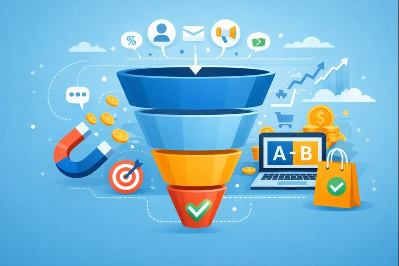
Step 2: Funnel alignment (ads → page → next step)
Most underperforming funnels aren’t “bad.” They’re misaligned.
☐ Landing page headline matches the ad promise (same language).
☐ The page delivers the reason to click within 5 seconds.
☐ Each traffic source has a dedicated page (or clearly tailored section).
☐ Navigation is removed or minimized on hard-sell pages.
☐ The next step is the easiest step (micro-commitment first when needed).
☐ Thank-you page includes a next action (book, download, add-to-calendar).
Micro conversions to track at minimum:
- CTA click rate
- Form start rate
- Form completion rate
- Checkout start rate
- Payment success rate
Step 3: UX friction killers (quietly crush conversions)
People don’t read—they scan. Make ‘yes’ feel easy.
☐ Each section makes one point (not five).
☐ Long paragraphs replaced with scannable bullets where possible.
☐ Numbers are specific (timelines, turnaround, outcomes) when true.
☐ Popups don’t interrupt too early (especially on mobile).
☐ No forced account creation before value (trials/ecommerce).
☐ Primary CTA remains visible on mobile where appropriate (sticky CTA).
Form & lead capture upgrades (big impact, fast)
☐ Remove non-essential fields (every field is a tax).
☐ Inline help text for confusing fields.
☐ Privacy reassurance line (“No spam. Unsubscribe anytime.”).
☐ Qualify after the initial capture (multi-step forms often help).
☐ Friendly error messages that say exactly what to fix.

Step 4: Trust & proof (make belief effortless)
People don’t buy products. They buy confidence.
☐ Proof is placed near the decision (not buried on a separate page).
☐ Show three proof types: results, credibility, safety.
☐ Pricing is transparent (or explained clearly).
☐ FAQ near the CTA addresses objections.
☐ Guarantees/returns are clear and easy to find.
Ecommerce note: Baymard’s research compilation reports an average cart abandonment rate around ~70%, which usually signals fixable friction and uncertainty in checkout.
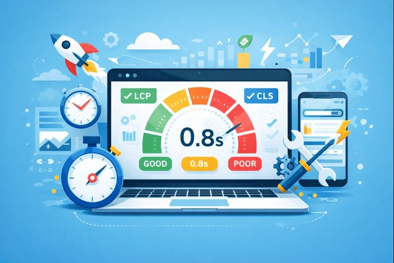
Step 5: Speed & Core Web Vitals (the 2026 update)
Performance is not only load time. It’s also how fast the site feels when someone taps, scrolls, or clicks.
Core Web Vitals commonly focus on LCP (loading), CLS (visual stability), and INP (responsiveness). INP replaced FID as a Core Web Vital in March 2024, so older audits can be outdated.
☐ Compress + correctly size images (serve modern formats when possible).
☐ Lazy-load below-the-fold images.
☐ Reduce third-party scripts (chat widgets/trackers add cost).
☐ Delay non-critical JavaScript.
☐ Use fewer heavy fonts; preload only what you need.
☐ Make tap targets large and interactions feel instant on mobile.
Step 6: Checkout / payment flow (where money gets lost)
☐ Guest checkout allowed (or account creation delayed).
☐ Total cost shown early (shipping, taxes, fees).
☐ Payment methods match your audience’s expectations.
☐ Clear error states (especially card failures).
☐ Reassurance at final step (security, returns, delivery).
☐ Progress indicator for multi-step checkout.
☐ Limit ‘surprise work’ (coupon fields can distract).
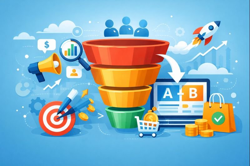
Step 7: Experimentation that doesn’t waste time (A/B + guardrails)
Once basics are stable, CRO experiments can compound gains.
☐ Hypothesis tied to a specific metric (not vibes).
☐ One main change at a time on low-traffic sites.
☐ Measure primary conversion rate + revenue per visitor + lead quality.
☐ Run long enough to cover weekday/weekend behavior.
☐ Log tests in a CRO journal (date, change, result, lesson).
High-impact test ideas:
- Outcome-based headline vs. generic headline
- Proof near CTA (logos/reviews/mini-case study) vs. proof below
- Long form vs. 2-step form
- Risk reversal/guarantee line vs. none
- ‘What happens next’ section under CTA vs. none
Step 8: Retention loops (conversion isn’t the finish line)
☐ Post-lead / post-purchase onboarding email sequence.
☐ Thank-you page offers the next best action.
☐ Follow-ups segmented by intent (pricing vs. blog vs. product).
☐ Remarketing audiences built around intent events.
☐ One authority asset (guide, calculator, comparison page).
Common “looks fine” problems that crush conversion
- Traffic mismatch: great ads, wrong landing page angle.
- Too many CTAs: people don’t choose when everything is a choice.
- Proof buried: testimonials hidden three clicks away.
- Slow + jumpy pages: layout shifts make the site feel broken.
- No next step: thank-you pages that dead-end the journey.
- No measurement discipline: optimizing on bad data.
What’s the difference between CRO and website optimization?
CRO (conversion optimization) focuses on improving outcomes like leads, bookings, or sales. Website optimization can include CRO, but also covers performance, SEO, accessibility, and maintenance.
What’s a realistic way to improve website conversions without a redesign?
Start with the fastest, highest-impact fixes: clarify the offer above the fold, reduce form fields, add trust near the CTA, and improve speed on key pages.
How do I know which page to optimize first?
Start with the highest-intent page that gets meaningful traffic (pricing, core landing page, top product page). Use micro conversions to locate the biggest drop-off step.
Why does site speed matter so much for conversion?
Because slow sites create impatience and doubt. Research shared by Google indicates bounce probability rises sharply as load time increases; small gains can improve the user journey.
What Core Web Vitals should SMBs pay attention to in 2026?
LCP (loading), CLS (visual stability), and INP (responsiveness). INP replaced FID as a Core Web Vital in March 2024, so ensure your audits use current metrics.
How many tests should I run per month?
If traffic is modest, 1–2 meaningful tests per month is enough. Focus on clarity, trust, and friction reduction before tiny UI tweaks.
What’s the fastest conversion funnel optimization win?
Remove one step, remove one uncertainty, or remove one distraction: fewer fields, clearer pricing, fewer checkout surprises, or better ad-to-page alignment.
Conclusion: your 30-day action plan
Here’s a simple plan to improve website conversions without turning your business into a never-ending website project:
- Week 1: Tracking QA + define primary and micro conversions.
- Week 2: Fix above-the-fold clarity + simplify the next step.
- Week 3: Upgrade trust/proof + speed/Core Web Vitals quick wins.
- Week 4: Run 1 A/B test on the highest-intent page; document the lesson.
If you run this playbook consistently, conversion rate optimization becomes a system—not a guessing game.

Published By | Sahaf Mahmud | Founder & CEO @ UpGrail Digital